Daniel's blog on data visualization, image processing, etc.
Table of Contents
With the help of ChatGPT, finding information has become easier, resulting in a wealth of tips and tricks that can be difficult to manage. I primarily use Python, focusing on data visualization and image analysis, and plan to regularly update this blog with useful information for others. Additionally, this blog serves as an opportunity for me to practice using Emacs org-mode for writing and organizing what I learn in one place.
The stylesheet for this document is taken from Nicolas Rougier's https://github.com/rougier/notebook-mode. I'm using his nano-theme for my Emacs.
1. Plotting alphafold pLDDT colors on with line segments
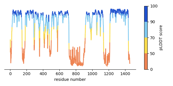
You can extract the pLDDT (B-factor column) values from an alphafold PDB file using this awk script:
#!/usr/bin/awk -f
# pipe the output of this script with `sort -k1 -n` to sort by residue number

# For each record that starts with 'ATOM'
/^ATOM/ {
    # get the residue id field
    resid = substr($0, 23, 4)
    # residue name field
    resname[resid] = substr($0, 18, 3)
    bfac = substr($0, 61, 6) + 0
    if (bfac == bfac) {
        sum[resid] += bfac
        count[resid] += 1
    }
}
END {
    for (resid in sum) {
        print resid, resname[resid], sum[resid] / count[resid]
    }
}
import matplotlib.cm as cm
import matplotlib.colors as mcolors
import matplotlib.pyplot as plt
import numpy as np
import pandas as pd
from matplotlib.collections import LineCollection

alphafold_colors = ["#ee8453", "#f9dc4d", "#7fc9ef", "#2152ce"]
af_cmap = mcolors.LinearSegmentedColormap.from_list(
    "pLDDT colors", colors=alphafold_colors
)

# for discrete boundaries for colors
plddt_bins = [0, 50, 70, 90, 100]
# map the bins to colors '.N' is the number of colors specified in the colormap above
cmap_boundary_norm = mcolors.BoundaryNorm(plddt_bins, af_cmap.N)

data = pd.read_table("images/plddt_values.txt")
# remove whitespace from column headers
data.columns = data.columns.str.strip()

x = data["resnum"].values
y = data["plddt"].values
xy = np.column_stack([x, y])

segments = np.concatenate(
    [xy[:-1, None, :], xy[1:, None, :]], axis=1
)

lc = LineCollection(segments, cmap=af_cmap, norm=cmap_boundary_norm, linewidth=2)
lc.set_array(y)

fig, ax = plt.subplots(figsize=(6,3))

ax.add_collection(lc)
ax.autoscale()
ax.set_xlabel("residue number")

# Remove spines
ax.spines['left'].set_visible(False)
ax.spines['right'].set_visible(False)
ax.spines['top'].set_visible(False)
ax.yaxis.set_visible(False)

# add colorbar
fig.colorbar(
    cm.ScalarMappable(cmap=af_cmap, norm=cmap_boundary_norm),
    label="pLDDT score",
    ax=ax
)

fig.tight_layout()
fig.savefig("images/plddt_plot.png")

return "./images/plddt_plot.png"
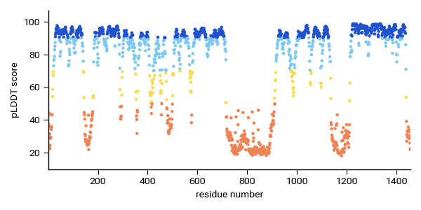
Alternatively you can just use plt.scatter to plot the same information with the same colorbar. The scatterplot is much easier:
fig, ax = plt.subplots(figsize=(6,3))
ax.scatter(x,y,c=y,cmap=af_cmap, norm=cmap_norm, s=5)
ax.set_ylabel("pLDDT score")
ax.set_xlabel("residue number")
2. Resolution of an objective lens
I was going through the excellent review article by Fazel et al. 2023 (https://arxiv.org/abs/2304.01456) and something clicked when I looked at Figure 2. I never really understood why higher NA objective lenses are actually needed to resolve smaller separation between points sources. I've been taking the fact that higher NA ∝ higher resolution for granted!
I made this animated version of the figure using matplotlib (without the objective lens):
import numpy as np
import matplotlib.pyplot as plt
from matplotlib.animation import FuncAnimation
from IPython.display import HTML

plt.rcParams["animation.embed_limit"] = 40.0

# setup coordinates
dy = 0.085
dx = 0.085
xmax = 40.0 # micron
ymax = 20.0
xpos = 5.0
ycenter = ymax / 2.0

y = np.arange(0, ymax, dy)
x = np.arange(0, xmax, dx)

Y,X = np.meshgrid(y, x, indexing='ij')
λ = 0.800
k = 2 * np.pi / λ

def compute_image(sep):
    y1 = ycenter + sep / 2
    y2 = ycenter - sep / 2
    θ1 = np.sqrt((Y-y1)**2 + (X-xpos)**2)
    θ2 = np.sqrt((Y-y2)**2 + (X-xpos)**2)
  frame = np.cos(k * θ1) + np.cos(k * θ2)
  return frame

y_seps = np.abs(np.linspace(-10, 10, num=60))
# nseps = 200
# maxsep = 10.0
# y_seps = np.abs(maxsep * np.cos(2*np.pi/nseps * np.linspace(0,nseps)))

frame = compute_image(y_seps[0])

fig, ax = plt.subplots(figsize=(10,5))
ax.set_xlabel("z-position, µm")
ax.set_ylabel("y-position, µm")
im = ax.imshow(frame, extent=(0, xmax, 0, ymax), cmap='cividis')
pt1 = ax.plot(xpos, ycenter + y_seps[0]/2, 'wo', mec='k', ms=7)
pt2 = ax.plot(xpos, ycenter - y_seps[0]/2, 'wo', mec='k', ms=7)

def update_frame(i):
    new_frame = compute_image(y_seps[i])
    pt1[0].set_data([5.0], [ycenter + y_seps[i]/2])
    pt2[0].set_data([5.0], [ycenter - y_seps[i]/2])
    im.set_data(new_frame)
    ax.set_title(f"Δ = {y_seps[i]:.2f} µm; λ = {λ * 1000:.0f} nm")
    return im, pt1, pt2

anim = FuncAnimation(fig, update_frame, frames=np.arange(y_seps.size), interval=50)

anim.save("point_separation_interference.mp4")
The closer each points become, the larger the angles between of the destructive interference fringes. We need these fringes to actually resolve the points sources. When the separation becomes very close (smaller than the wavelength), you can see that the destructive interference "goes away" and the point source behave like a single points source. I didn't appreciate the fact that when points are far apart (much larger than the wavelength), these destructive interference fringes form even along y-coordinates between the points.. I guess I should think more about waves…
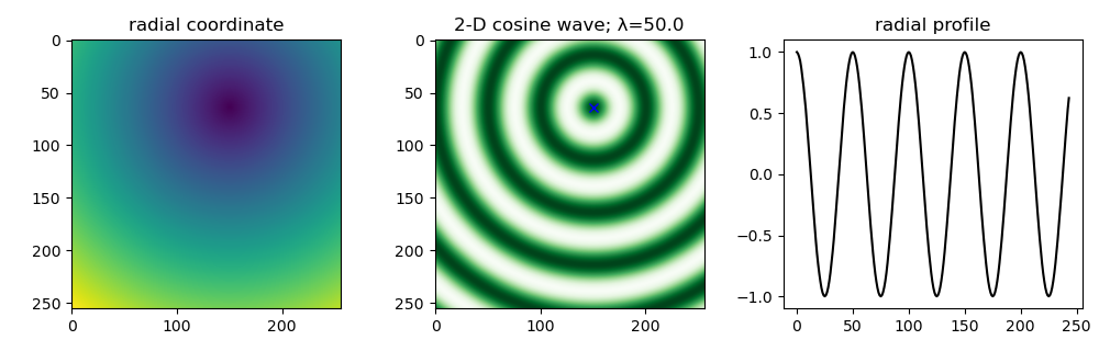
3. Taking a radial profile from an arbitrary center
It turns out you can use scipy.ndimage.mean to take a radial average of an n-dimensional image. To take the radial average from an arbitrary center you can just use scipy.ndimage.distance_transform_edt to compute the radial coordinates.
For this example, we'll create a cosine in 2D.
import numpy as np
import scipy.ndimage as ndi
import matplotlib.pyplot as plt

Ny, Nx = 256, 256
originxy = (150.0, 64.0)
x, y = np.meshgrid(np.arange(Nx), np.arange(Ny))
Θ = np.sqrt((x - originxy[0])**2 + (y - originxy[1])**2)

# specify wavenumber of cosine
λ = 50.0 # wavelength
k = 2 * np.pi / λ
# plot cosine wave
coswave = np.cos(k * Θ)

# calculate radial profile
r_bins = np.round(Θ).astype(int)
unique_r = np.unique(r_bins)
radial_profile = ndi.mean(coswave, labels = r_bins, index = unique_r)

fig, ax = plt.subplots(ncols=3, figsize=(10,3.2))
ax[0].imshow(Θ)
ax[0].set_title("radial coordinate")
ax[1].imshow(coswave, cmap='Greens')
ax[1].plot(originxy[0], originxy[1], 'bx')
ax[1].set_title(f"2-D cosine wave; λ={λ}")
ax[2].plot(unique_r, radial_profile, 'k-', lw=1.5)
ax[2].set_title("radial profile")
fig.tight_layout()
fig.savefig("./images/radial_profile.png")
plt.close(fig)

# needed for inline org-mode
return "./images/radial_profile.png"
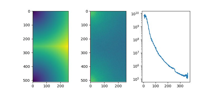
This can be useful when trying to compute radial average of a power spectrum
import numpy as np
from matplotlib.colors import LogNorm
import scipy.ndimage as ndi
import matplotlib.pyplot as plt
import skimage as sk

img = sk.data.human_mitosis()
ft_img = np.fft.rfft2(img)
ps = np.abs(ft_img)**2

# get spacing from the frequency grids
# we dont want frequencies so we just multiply back with shape
u = np.fft.fftfreq(img.shape[0]) * img.shape[0]
v = np.fft.rfftfreq(img.shape[1]) * img.shape[1]
ky, kx = np.meshgrid(u,v, indexing='ij')

ξ = np.sqrt(ky*ky + kx*kx)

fig, ax = plt.subplots(ncols=3, figsize=(8, 3.5))
ax[0].imshow(ξ)
ax[1].imshow(ps, norm=LogNorm())

freq_bins = np.round(ξ).astype(int)
unique_freqs = np.unique(freq_bins)
ps_profile = ndi.mean(ps, labels=freq_bins, index=unique_freqs)

ax[2].plot(unique_freqs[5:], ps_profile[5:], '-')
ax[2].set_yscale("log")
plt.savefig("./images/power_spectrum.png")

return "./images/power_spectrum.png"
4. Making a multi-channel composite image with custom colormap.
With a bonus of animating through the Z-slices. The link to the notebook is here (via github).
The tricks used here is a subject for future posts:
- displaying a 'frameless' image with
imshow()in matplotlib - mapping a grayscale image to an arbitrary colormap in matplotlib
- making composite multi-channel image with those said colormaps
- saving matplotlib animation as
.mp4or an interactive HTML.
5. Emulating an argmax() function
You can emulate argmax() function (returns the index of the maximum value in a sequence) in Python by doing:
mylist = [1,7,3,1,5]
res = max(enumerate(mylist), key=lambda x: x[1])

# needed for inline org-mode
return res
(1, 7)
This returns the argmax and the max value from a list. I occasionally use this when I don't need to use NumPy for a simple script.
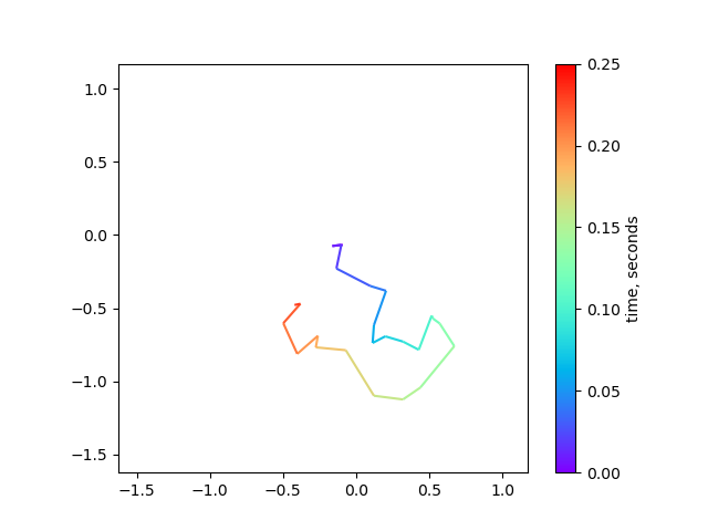
6. Plotting multi-colored line in matplotlib
When plotting the 2D trajectory of diffusing particles or diagnosing drift in microscopy timelapse data, it can be helpful to use color to indicate time. This can be achieved using the matplotlib.collections.LineCollection object. In this example, we'll simulate 2D diffusion and plot the trajectory of a single particle over time.
from matplotlib.collections import LineCollection
from matplotlib.colors import Normalize
import matplotlib.pyplot as plt
import numpy as np

dt = 0.010
D_coef = 1.0
Nt = 25

# simulate diffusion steps
xsteps = np.random.randn(Nt) * np.sqrt(2 * D_coef * dt)
ysteps = np.random.randn(Nt) * np.sqrt(2 * D_coef * dt)

# construct a (cumulative) trajectory from the steps
x = np.cumsum(xsteps)
y = np.cumsum(ysteps)

# assemble into Nt x 2 array
xy = np.column_stack([x,y])

# create a list of line segments from xy[n, :] to xy[n+1, :]
# For N points, there will be N-1 line segments connecting between points
# use the 'np.newaxis = None' trick to create a new axis (at axis=1)
# this makes Nt-1 x 2 x 2 array to represent line segments 'from' -> 'to'
segments = np.concatenate(
    [xy[:-1,None,:], xy[1:,None,:]], axis=1
)

# create the line segments to be drawn
lc = LineCollection(
    segments, cmap="rainbow", norm=Normalize(0,Nt * dt),
    linewidths=1.5
)

# this sets the data array for each segment
# each data point gets mapped to a color by the 'cmap' and 'norm'
lc.set_array(np.arange(Nt) * dt)

# plot the data
fig, ax = plt.subplots()
ax.add_collection(lc)

# set axis limit
axlim_min = min(x.min(), y.min()) - 0.5
axlim_max = max(x.max(), y.max()) + 0.5

ax.set_xlim((axlim_min, axlim_max))
ax.set_ylim((axlim_min, axlim_max))
ax.set_aspect("equal")

fig.colorbar(lc, ax=ax, label="time, seconds")

fig.savefig("./images/simulated_diffusion.png")
plt.close(fig)

# needed for inline org-mode
return "./images/simulated_diffusion.png"